
Lumanu Design System
A design system for a content creator-focused invoicing app
Role
UX/UI Design, Design System Management and Documentation
Team Credits
Anh Hoang, Product Designer
Lia F., Head of Product Design
Cas Z., Senior Product Designer
Rishma M., Senior Product Designer
Mitch M., UX Engineer
Max M., UX Engineer
Problem and Context
Lumanu had plans to build a new native mobile app, and rather than continue to use the outdated and lacking design system employed for their web app, the company wished to create and maintain a new design system for this new product.
Why a New Design System?
The existing design system was considered limited and was thus often underutilized or used incorrectly. Some of the key problems experienced:
Duplication of common components.
Components were often detached because they were deemed inadequate or insufficient for a project.
Lack of documentation meant that certain components were used incorrectly.
Foundations
Before we could begin creating anything, we had to establish our foundations, or the building blocks of our user interface elements. Our foundations consisted of our brand logos, color systems, typography scales, grid systems, and spacing scale.
We made a deliberate effort to apply design tokens to our foundations to help us achieve parity between our designs and engineering implementation, as well as ensure ongoing consistency even when a value assigned to a token is to be updated.

Colors
Lumanu had an established branding guideline upon which to base certain foundations such as colors and typography, but these still needed to be expanded upon in order to apply them to product. This meant introducing a full-range grayscale palette as well as those for feedback and interaction.

Typography
For the typescales, we created display headings that were separate from the utility headings. This was a direct response to criticisms of the old design system, which used the brand’s decorative display font for all headings regardless of size or application. Having two separate heading options allowed for stronger usability, and it encouraged designers to be more deliberate about the use of the display font/heading.
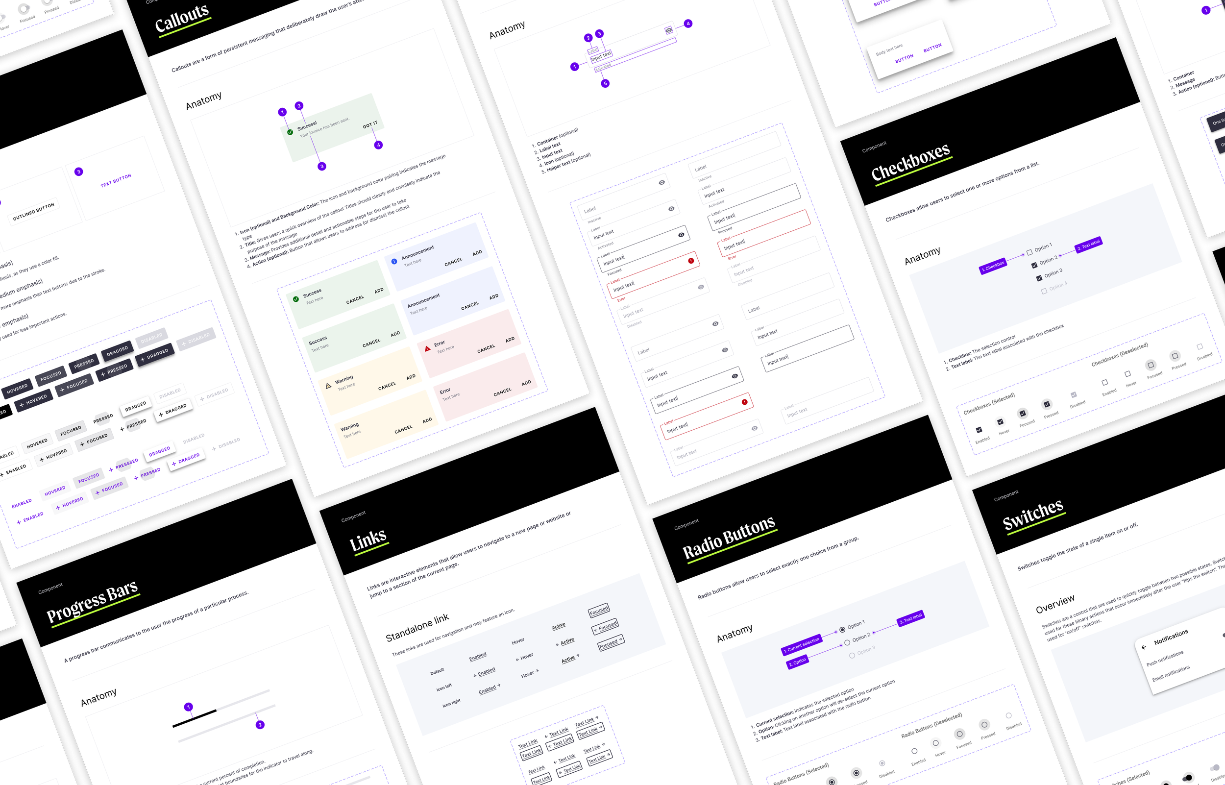
Components
In order to attain buy-in from stakeholders for this new design system, it was proposed that we adopt existing components from Google’s Material Design system. This would drastically reduce the engineering lift that would otherwise exist had we opted to create all brand new components from scratch.
That said, these components were not ready to use directly “out of the box”. The design team still had to create all of the necessary variants for each applicable component, and as well as apply our newly established foundations to all of the components. We also ended up creating a handful of new components that we felt were lacking in Material Design for our specific needs. Once any given component was created or adapted using our foundations, it was reviewed by the team before added to the library and then published for use in our designs.
Documentation and Governance
The deficiency of the previous design system drove home the point that documentation and governance were going to be essential to the success and sustainability of the new system.
Working closely with my fellow product designers and front-end developers, I created and maintained documentation resources within the design system Figma file. This documentation included our design principles, accessibility standards, and usage guides and best practices for each respective component and pattern.
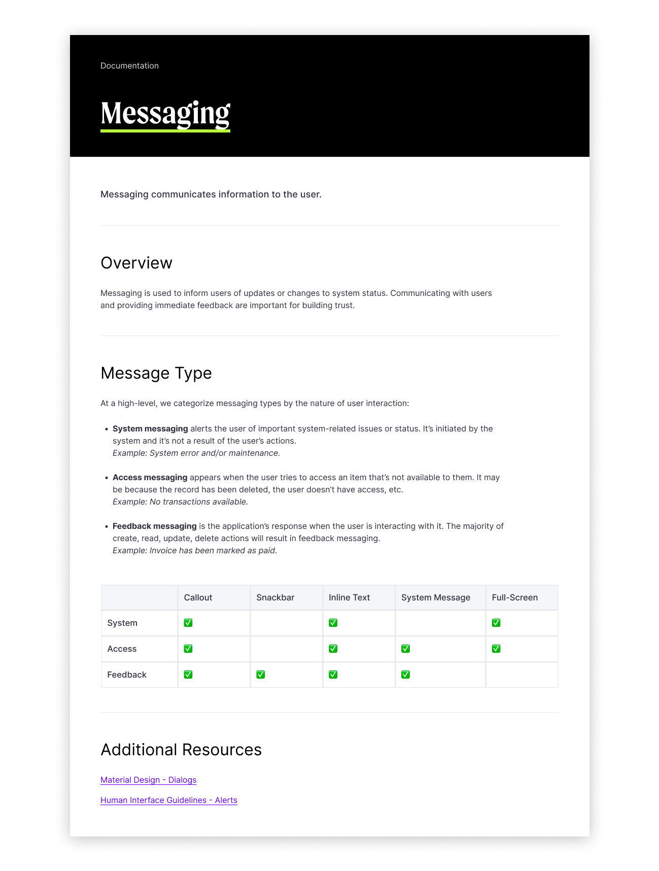
Extensive documentation on messaging was developed to help remove ambiguity as to what type of components ought to be used concerning in-app communication.

Usage guidelines were created to help designers understand the permissible use cases for each component.

Detailed information how to use spacing blocks and which sizes to use in relation to certain components.
Conclusion
When the component and pattern libraries were first published for use in our team Figma, there was a consensus that this new system was a vast improvement over the one that preceded it. It provided thoroughly developed foundations to create more effective designs for our users, and there was proper documentation to eliminate ambiguity and ensure that elements were used properly. This in turn would allow the company to ship projects more efficiently, as engineers spent less time recreating components that already existed in the codebase, and designers could dedicate more time to solving UX problems instead of dwelling on the correct UI elements.
This project also drove home the point that collaboration is key, as a design system ought to be usable for both designers and front-end engineers. Regular syncs with our team of both designers and engineers gave us the opportunity to connect in real-time and discuss any additions to the system as well as address any possible feedback.
As any design system designer will tell you, a design system is never finished but is rather a living project that grows and evolves with the needs of the product(s). Nevertheless, I feel confident in saying that the team and I have thus far been able to effectively build a design system from the ground up, as well as educate teams across the organization on the value of a common design language.